The Domino Effect: Mapping How Market Shocks Spread Across Fragile Regions
In humanitarian contexts, food insecurity never happens in isolation. A sudden price spike in one urban market can cascade through trade corridors, triggering inflationary waves in rural provinces hundreds of kilometres away, pushing millions deeper into acute food crisis (IPC Phase 3+). Project HERO's TSgraph module was built to map exactly these invisible pathways.
📍 Case Study: Afghanistan (AFG)
Throughout this page we illustrate the network analysis framework on Afghanistan's WFP food market system, in a country where rugged geography, fragmented infrastructure, and active conflict create one of the most complex trade networks in the HERO dataset. The same analysis pipeline is applied automatically to every country monitored by the platform.
1. From Raw Prices to Network Signals
Most analyses aggregate market data monthly, a choice that erases the very signals most relevant to early warning. HERO operates at native temporal resolution: daily and weekly WFP price readings, preserved to capture short-term lead-lag dynamics between markets before they are smoothed away.
Network Analysis Pipeline Architecture
Data Ingestion
Raw WFP market price data & Log-Return conversion
Dependency Estimation
Pearson Correlation, Mutual Info & Transfer Entropy
Filtering & Topology
Statistical filter (p < 0.05, r > 0.7), Betweenness Centrality & Degree Dist
Visual Analytics
Bidirectional cross-highlighting (Leaflet Map & Plotly Charts)
Raw price series are first converted into log-returns to ensure stationarity. Three complementary dependency measures are then computed for every market pair:
Pearson Correlation
Captures instantaneous co-movement: markets that inflate and deflate in sync, regardless of distance.
Mutual Information
Detects complex, non-linear statistical dependencies invisible to standard correlation, critical in disrupted supply chains.
Symbolic Transfer Entropy
Determines who drives whom, measuring the direction of inflationary contagion along the trade corridor.
Only edges that pass a dual significance filter (p < 0.05 and r > 0.7) are retained in the final graph, ensuring every connection represents a statistically robust market dependency.
2. What the Network Reveals: Afghanistan’s Market Topology
Once filtered, the graph is analysed for its topological properties, structural features that reveal how resilient or fragile the regional market system truly is. The screenshot below shows the full TSgraph interface for Afghanistan, with Pearson correlation at lag 0 and a weight threshold ≥ 0.48:
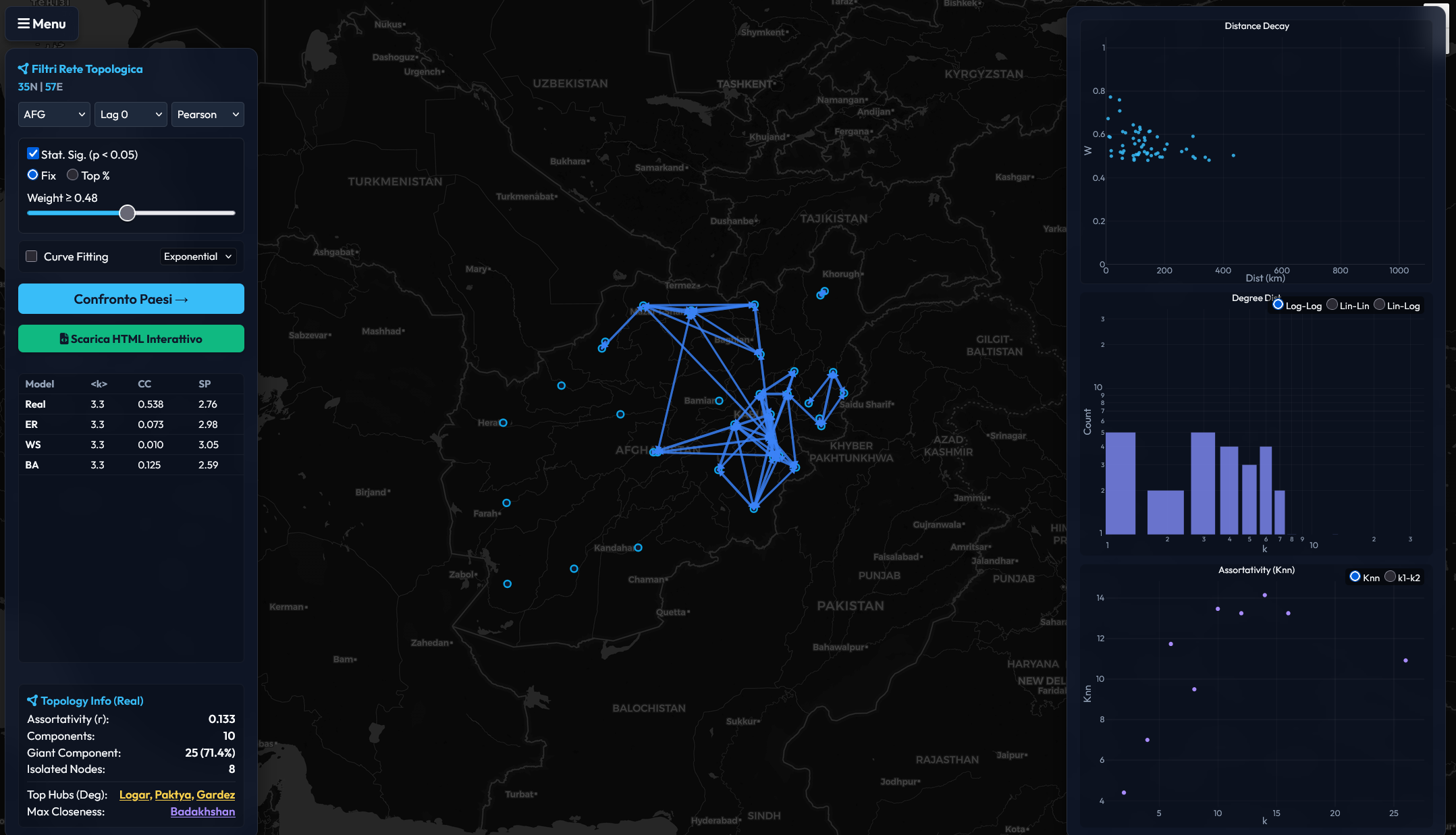
The TSgraph interface for Afghanistan (AFG): geographic Leaflet map (centre) showing the filtered market network, topological control panel (left) with real-time metrics, and three statistical panels (right), covering Distance Decay, Degree Distribution, and Assortativity scatter.
🗺️ Geographic Network (Centre Panel)
Afghanistan's filtered market network reveals a dense central cluster in the Kabul–Ghazni–Paktya corridor and a secondary cluster along the northern Kunduz–Takhar axis. Peripheral provinces (Helmand, Farah, Zabul) remain isolated; their markets operate independently from the national price system, making them invisible to conventional early warning based on capital-city prices.
Key topological hubs: Logar, Paktya, and Gardez emerge as the top degree nodes, acting as the critical transit corridors through which inflationary shocks propagate between eastern and central Afghanistan.
📊 Topological Metrics (Left Panel)
| Metric | Real Network | ER | WS | BA |
|---|---|---|---|---|
| ⟨k⟩ (Avg Degree) | 3.3 | 3.3 | 3.3 | 3.3 |
| CC (Clustering Coeff) | 0.538 | 0.073 | 0.010 | 0.125 |
| SP (Avg Shortest Path) | 2.76 | 2.98 | 3.05 | 2.59 |
The real network's clustering coefficient (0.538) is 7× higher than Erdős–Rényi and 4× higher than Barabási–Albert, providing strong evidence that Afghan markets form tightly knit local clusters rather than a random mesh. The relatively short average path (2.76) combined with high clustering is the hallmark of a small-world network.
Additional Topology Insights: Afghanistan
0.133
Assortativity (r)
Weakly assortative: high-degree hubs tend to connect to other hubs, forming a resilient core.
10
Components
The network fragments into 10 disconnected components, showing evidence of geographic and conflict-related market isolation.
71.4%
Giant Component
25 of 35 markets belong to the largest connected subgraph, representing the backbone of Afghanistan's price transmission system.
8
Isolated Nodes
Eight markets are completely disconnected, operating as autonomous price islands with no detectable linkage to the national system.
Benchmarking Against Theoretical Models
To test whether observed trade networks exhibit genuinely non-random structure, HERO compares each filtered graph in real time against three synthetic baselines generated with identical node and edge counts:
| Model | Type | What it tests |
|---|---|---|
| Erdős–Rényi (ER) | Random | Are connections purely random? |
| Watts–Strogatz (WS) | Small-world | Do markets cluster locally? |
| Barabási–Albert (BA) | Scale-free | Do hubs emerge preferentially? |
Empirical networks consistently deviate from ER randomness and align more closely with BA scale-free topology, demonstrating that real humanitarian market systems are structured rather than stochastic.
3. Distance Decay: How Geography Shapes Market Connectivity
One of the most universal regularities uncovered by the TSgraph module is distance decay, the exponential weakening of market linkages as geographic separation increases. But the rate of decay varies dramatically between countries, encoding deep structural information about infrastructure quality, terrain, and conflict-driven market fragmentation.
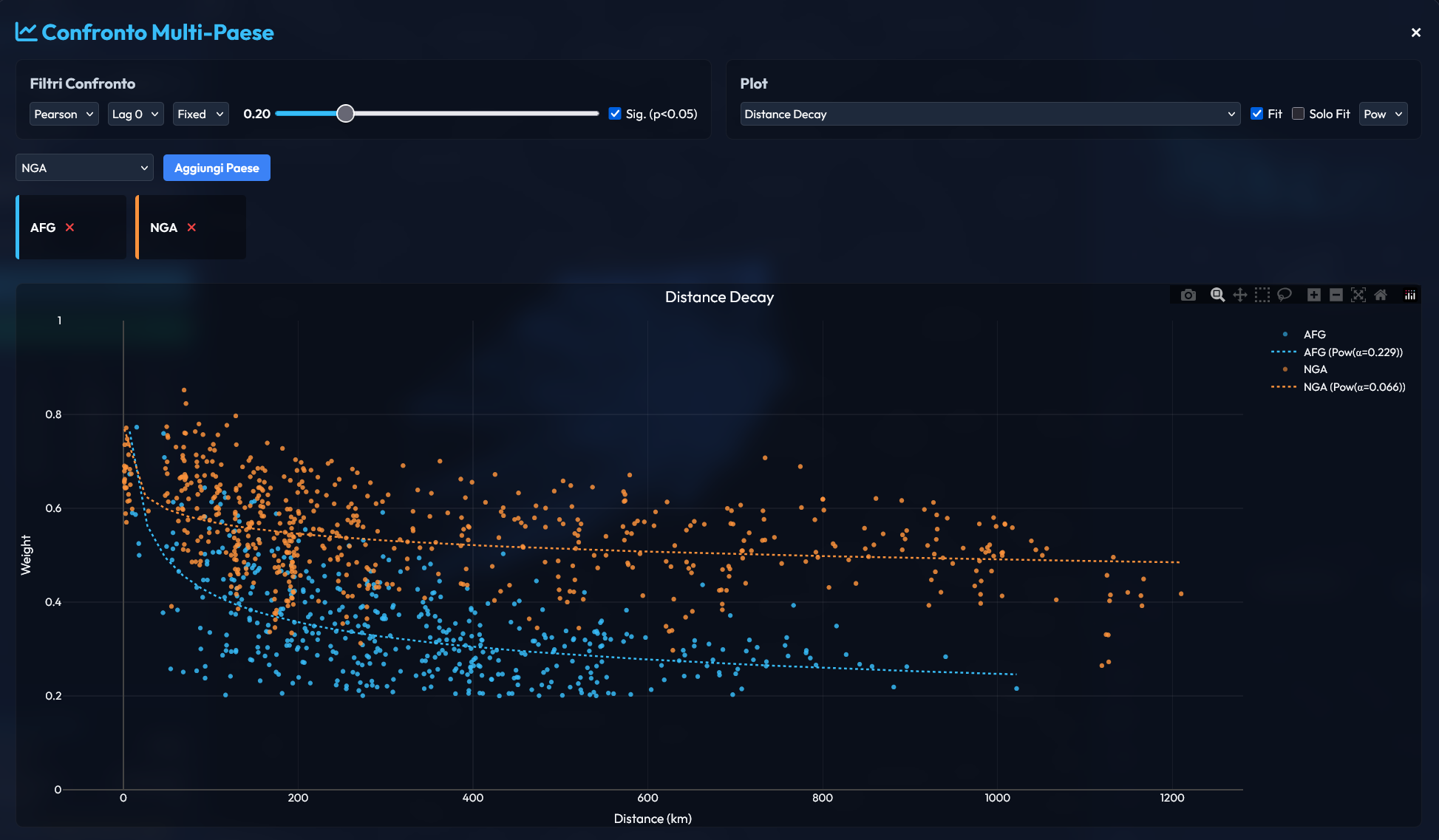
Multi-country distance decay comparison (Afghanistan in blue vs Nigeria in orange). Both show a clear declining trend, but with strikingly different decay rates. Power-law fits: AFG α = 0.229, NGA α = 0.066.
Reading the Decay Curves
Afghanistan (α = 0.229): A steep decay where market correlation drops sharply beyond ~200 km. This reflects Afghanistan's extreme terrain (Hindu Kush mountain ranges, limited paved roads) and conflict-disrupted supply lines. Distant markets are almost entirely disconnected.
Nigeria (α = 0.066): A much flatter curve; even at 1,000+ km separation, Nigerian markets maintain correlation weights around 0.5. This is consistent with Nigeria's better road infrastructure and more integrated national supply chain, but it also means that price shocks propagate further and faster.
Policy implication: In steep-decay countries like AFG, interventions must be hyper-local. In flat-decay countries like NGA, a single market disruption can cascade nationally.
4. Assortativity & Market Hierarchy: Comparative Dynamics
Network assortativity measures the tendency of major market hubs to connect with one another (creating a resilient, interconnected core) versus linking primarily to isolated peripheral markets. By comparing the assortativity scatter profiles of Afghanistan (AFG) and Sudan (SDN), we observe a striking structural similarity that underscores a shared vulnerability in their supply chains.
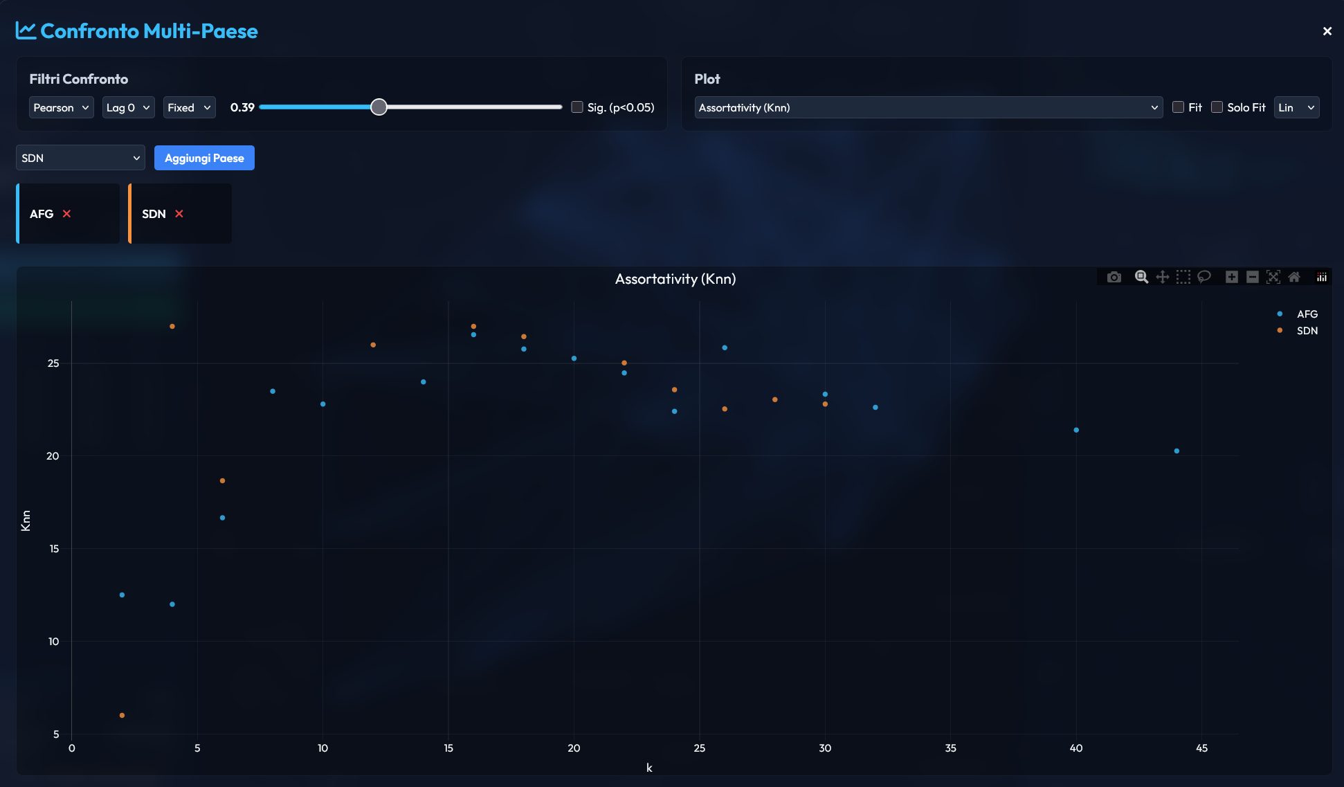
Assortativity scatter plot comparing node degree (k) against average neighbor degree (Knn) for market nodes in Afghanistan (blue) vs Sudan (orange).
5. Bidirectional Visual Analytics
The TSgraph interface connects geographic space (Leaflet maps) to analytic space (Plotly distributions) through a live cross-highlighting system. Every click propagates across both views simultaneously:
📍 Map → Charts
Selecting a market on the geographic map highlights the same node across all statistical panels, instantly surfacing its degree, centrality rank, and spatial decay position.
📊 Charts → Map
Clicking an outlier in the scatter plots (e.g. two distant but highly correlated markets) lights up the corresponding nodes on the map, revealing non-obvious long-range trade dependencies.
Three analytical views are available simultaneously:
Distance Decay Analysis
Exponential spatial fitting W ∼ e−λd to quantify market link decay across trade corridors.
Degree Distribution
Power-law distribution fitting P(k) ∼ k−α to reveal commercial market hierarchy.
Assortativity Analysis
Scatter plot of degree vs nearest-neighbour degree (k vs Knn) to measure commercial hub connectivity.
🌍 Reproducibility Note: The full network analysis pipeline (graph construction, statistical filtering, topological benchmarking, distance decay fitting, and bidirectional visual analytics) is executed for every country in the HERO dataset. Cross-country comparisons (as shown for AFG vs NGA) are available via the dashboard's "Confronto Multi-Paese" modal.