Modelling Food Insecurity in Space and Time
The last stage of HERO turns the combined dataset into models. We use the same drivers for both models: conflict, displacement, rainfall, vegetation, food prices, and media coverage. From these drivers we answer two separate questions, and each question has its own model. In both cases the thing we predict is the share of the population in acute food insecurity, meaning IPC Phase 3 or above.
What explains global hunger?
Why is one area worse off than another? Using the drivers alone, we try to explain the level of acute food insecurity in each area, and to learn which drivers matter most.
What are hunger levels right now?
IPC assessments are expensive and slow. Most areas are updated only once or twice a year, so a sudden shock can go unseen for months. Between two assessments, we estimate the current level of acute food insecurity from the latest drivers.
Both models are built the same way. They use 13 features drawn from conflict, displacement, rainfall, vegetation, food prices, media coverage, and the time of year. We leave out the country name and the map coordinates on purpose. That way the model has to learn how the drivers relate to hunger, instead of simply memorising where each area is.
What explains global hunger?
To test this fairly, we hold out whole areas. The model trains on some areas and is scored on other areas it has never seen. This stops it from simply recalling an area’s usual level.
Hunger depends on context
The same drop in rainfall, the same level of conflict, or the same number of displaced people can mean very different things in the Sahel, the Horn of Africa, Central America, or Yemen. A single global model has to apply one rule across 37 very different settings, and that averages out the local patterns that actually matter.
On top of that, much of why one area is worse than another comes down to which country it is in. These long-standing differences between countries are already captured by a simple baseline: the average level of each country. So the global model that uses drivers only does not beat that country-average baseline.
| model | R² | MAE (pp) | RMSE (pp) |
|---|---|---|---|
| Country-average baseline | 0.549 | 8.55 | 11.37 |
| XGBoost (drivers) | 0.529 | 8.77 | 11.62 |
| LightGBM | 0.519 | 8.90 | 11.75 |
| RandomForest | 0.486 | 9.11 | 12.14 |
Based on 8,457 area-months, 507 admin-1 areas, and 37 countries.
The lesson is not that the drivers are weak. It is that the useful signal sits inside countries and regions, not in one global rule. This points to localisation: training the model on smaller groups of similar areas.
Localisation works, and the report text helps most
To localise, we retrain the same model at nine different scopes. A scope is simply the set of areas each model is allowed to learn from. These range from one global model, to six geographic regions, to one model per country. We also try grouping areas in two other ways: by the values of their drivers, and by what their IPC reports actually talk about.
| scope | R² | MAE (pp) | gain over global |
|---|---|---|---|
| global | 0.529 | 8.77 | — |
| regional | 0.617 | 7.64 | +0.088 |
| local (per country) | 0.589 | 7.91 | +0.144 |
| driver clusters (k-means) | 0.527 | 8.66 | −0.002 |
| driver clusters (hierarchical) | 0.538 | 8.51 | +0.009 |
| report text (tf-idf, k-means) | 0.658 | 7.17 | +0.127 |
| report text (tf-idf, hdbscan) | 0.657 | 7.31 | +0.124 |
| report text (embeddings, k-means) | 0.646 | 7.36 | +0.114 |
| report text (embeddings, hdbscan) | 0.657 | 7.30 | +0.126 |
The last column is the gain over the global model measured on the same areas, so the comparison is fair.
Two results stand out.
- Grouping areas by what their IPC reports describe works best. Reports tend to fall into clear types, such as conflict and refugees, farming and water, or prices and inflation. Grouping countries by these types beats both the geographic regions and the driver-value groups.
- A country’s own model wins where there is enough data. For the 11 countries with enough history to train their own model, the country model beats the global one in all 11.
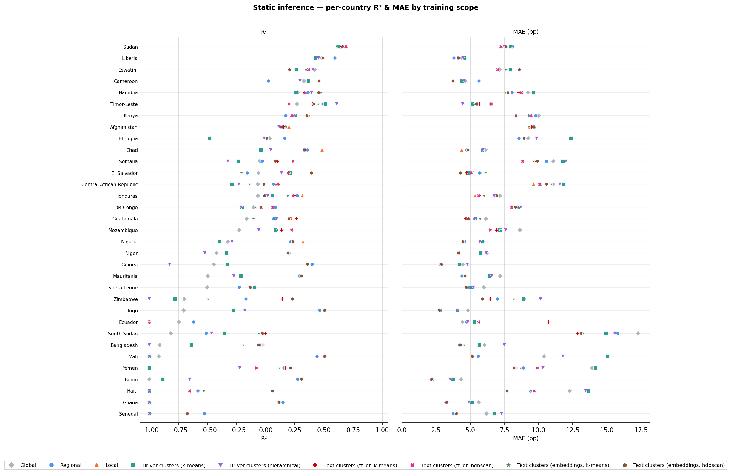
For almost every country the coloured regional, local and text-cluster markers sit to the right (higher R²) and to the left (lower MAE) of the grey global marker.
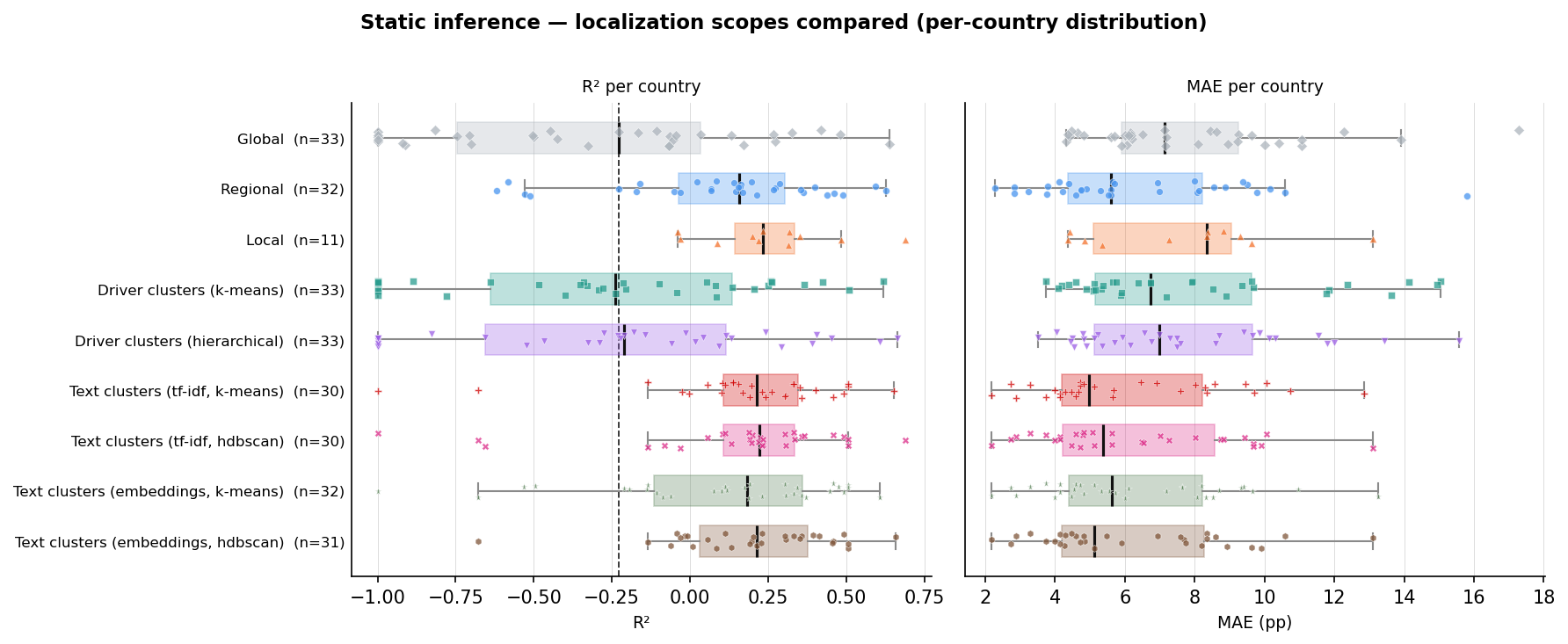
Each scope's per-country R² (left) and MAE (right). The dashed line is the global median R². A box sitting to its right usually beats global.
What drives acute food insecurity
“Explainability is even more important than performance.” — a WFP data scientist
In humanitarian work, decisions affect lives, so the results have to be explainable. Decision-makers need to see why the model expects hunger to rise or fall before they act on it.
The table below ranks the driver families by how much they move the model’s prediction, using SHAP values.
| driver family | importance |
|---|---|
| food prices | 4.04 |
| conflict | 3.88 |
| seasonality | 3.38 |
| vegetation | 2.87 |
| displacement | 2.56 |
| media | 2.15 |
| rainfall | 1.76 |
Food prices and conflict are the two strongest drivers. This matches what global reports say: economic pressure and violence are among the main causes of acute food insecurity. The chart below shows that more violent events and higher food prices push the predicted level of hunger up, and lower values push it down.
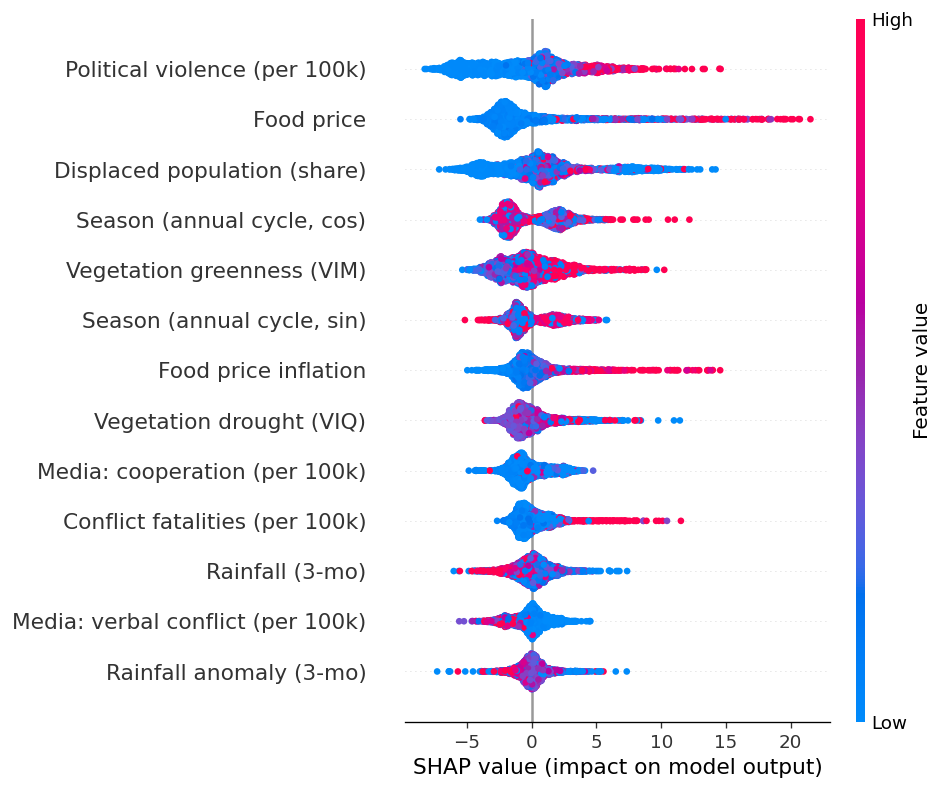
How each driver affects the predicted share of the population in IPC Phase 3 or above (global model).
What are hunger levels right now?
IPC assessments are thorough, but they are slow and costly, so most areas are reassessed only once or twice a year. The question here is simple: can we estimate an area’s current level of hunger from its last known assessment plus the latest drivers?
To keep this fair, we only ever train on the past and test on the future. The model never sees data from after the point it is predicting.
Hunger is sticky
Levels of acute food insecurity are persistent. Where an area stood at its last assessment tells you a lot about where it stands now. Crises can still shift sharply, but the last known level is a strong starting point, which is why simply carrying it forward is a baseline that is hard to beat.
Our nowcast builds on more than the single last value. It uses the last two assessments and the recent trend between them, then adds the latest drivers on top. Doing so lowers the average error by about 18 percent compared with carrying the last value forward, and the nowcast follows the direction of change instead of staying flat. When an area is getting worse, the nowcast tends to move with it.
| approach | R² | MAE (pp) | vs carry-forward |
|---|---|---|---|
| recent assessments + drivers + driver changes | 0.749 | 5.08 | +17.8% |
| recent assessments only | 0.683 | 5.88 | +4.9% |
| carry the last value forward | 0.625 | 6.19 | 0.0% |
| drivers only, no history | 0.503 | 7.66 | −23.9% |
Based on 1,487 area-months across 31 countries, pooled over five rolling test periods.
- The nowcast beats the carry-forward baseline in 17 of 21 countries.
- It tracks real change, not just the level. The match between predicted change and actual change since the last assessment is r = 0.54.
What the drivers add
The recent assessments do most of the work, and the drivers add the edge that catches movement.
| what the model knows | R² |
|---|---|
| recent assessments only | 0.683 |
| + the current drivers | 0.742 |
| + how fast the drivers are changing | 0.749 |
A model with drivers but no history does worse than carry-forward, which confirms that the recent assessments are the anchor. The extra accuracy the drivers bring comes from picking up movement, and the strongest early signal is the change in rainfall.
A real example: Afghanistan
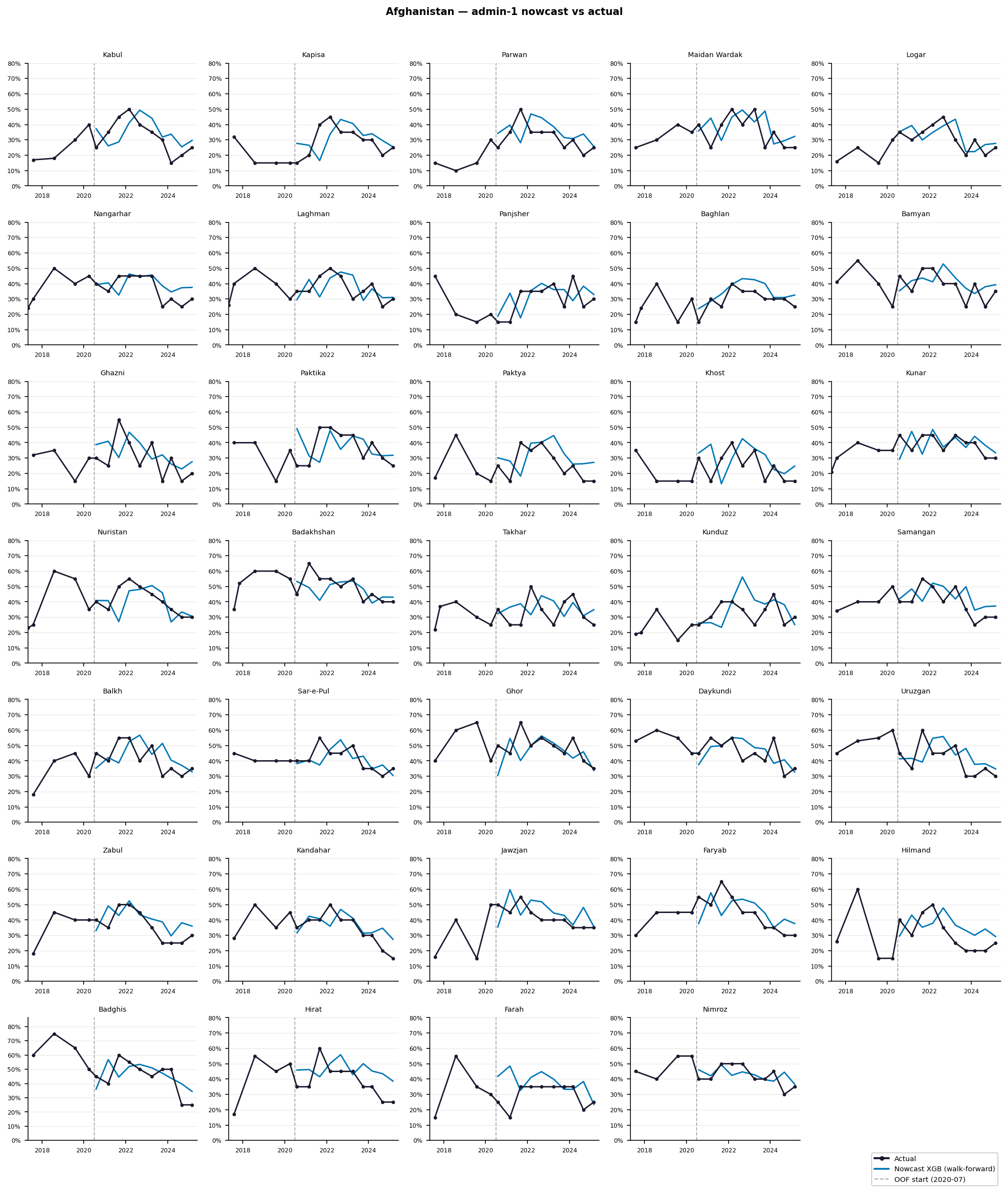
One panel per Afghan province. The nowcast (blue) is tracked against the observed IPC level (black). Everything to the right of the dashed line is out of sample. The nowcast follows the real path, including the turns, rather than holding the last value flat.
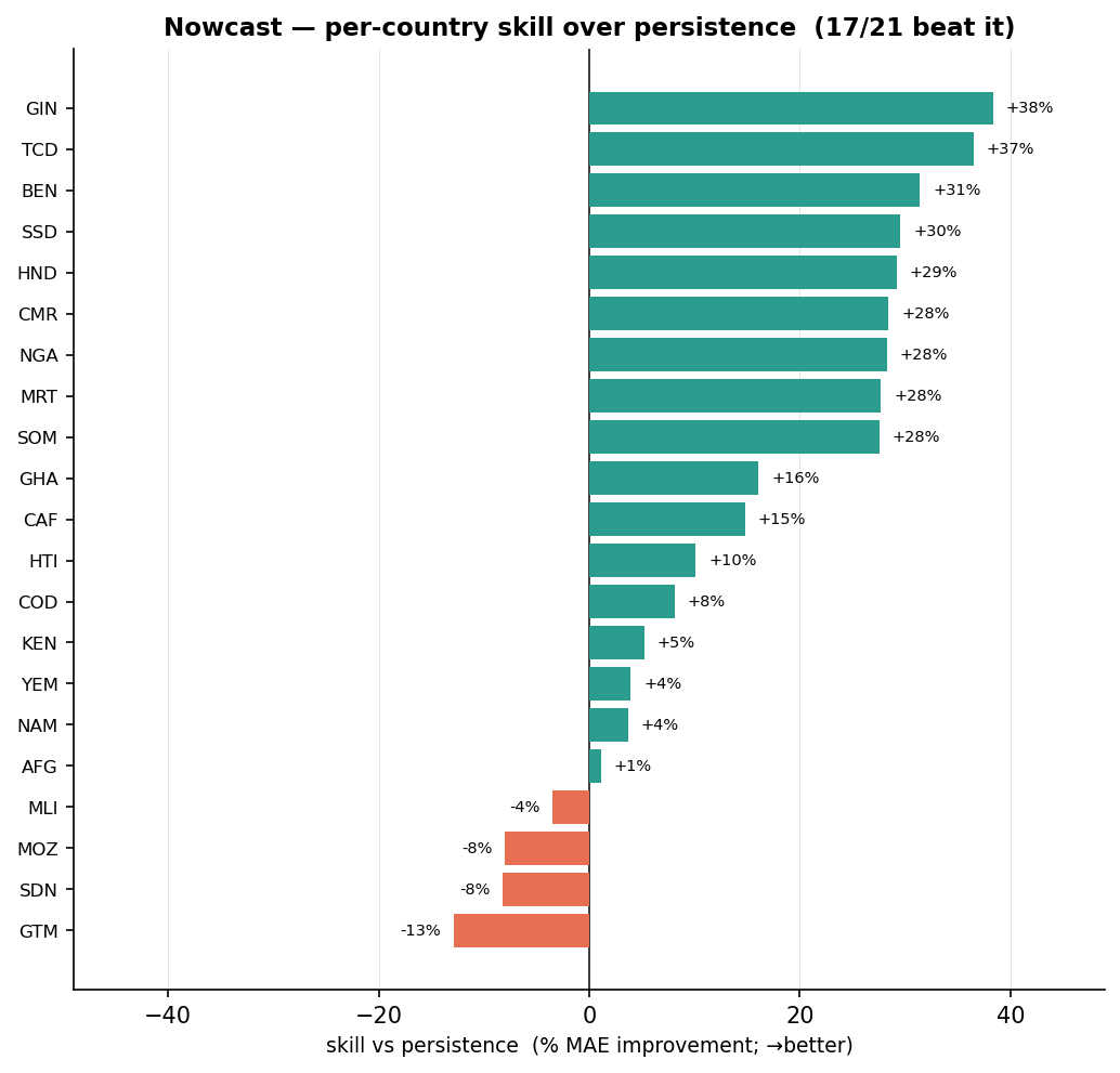
Per-country improvement over carry-forward. Positive almost everywhere.
One global model is enough
For the “why” question, tailoring the model to regions or countries helped a lot. For the “now” question it does not. We tested the same nine scopes, and every one of them lands within about 0.01 of the global model on the same areas. The reason is simple: once the model knows an area’s own last value, it already knows most of what a regional or country model could add. So for nowcasting, one global model is the right choice.
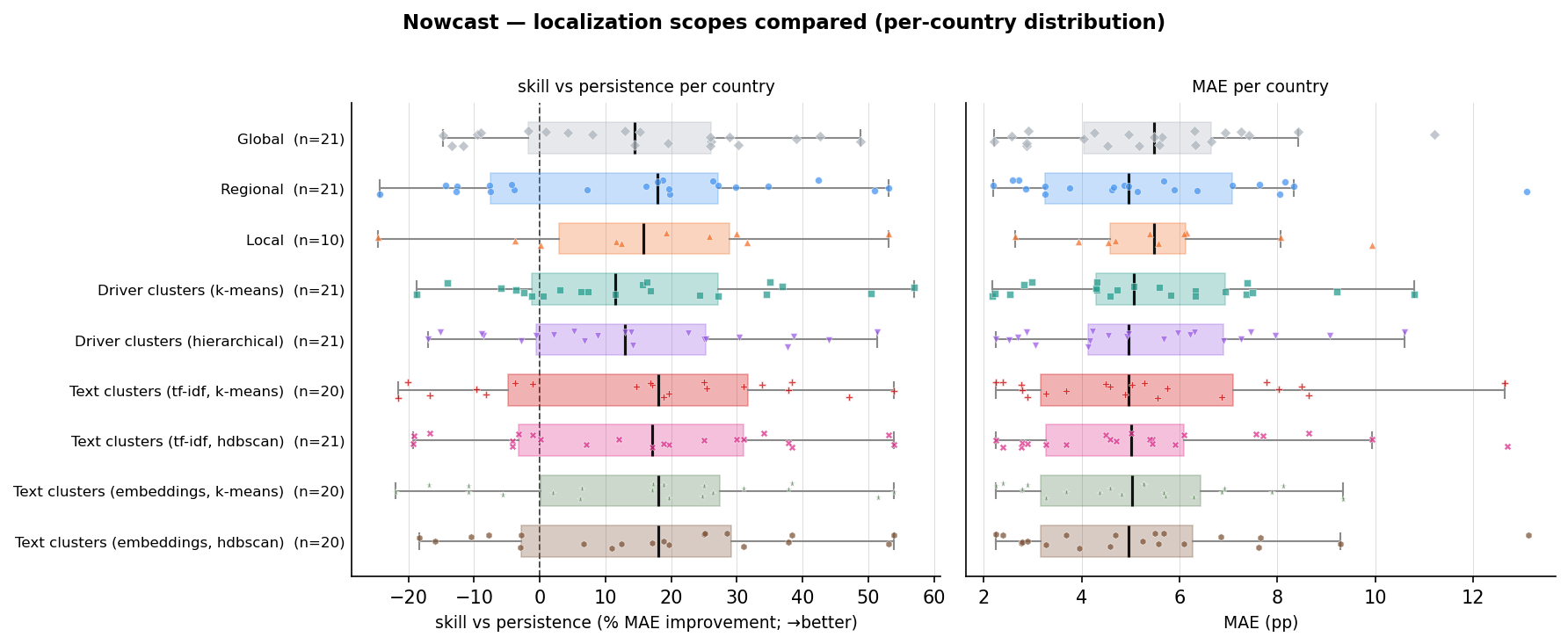
Improvement over carry-forward (left) and MAE (right) per country, by scope. Every box sits to the right of zero, so every scope beats carry-forward, and the boxes overlap almost exactly, so no scope is clearly better than global.
What drives the nowcast
| feature family | importance |
|---|---|
| recent assessments | 11.68 |
| rainfall | 2.26 |
| conflict | 1.41 |
| prices | 1.36 |
| vegetation | 1.19 |
| seasonality | 0.97 |
| displacement | 0.76 |
| media | 0.76 |
The recent assessments matter far more than any driver. The nowcast is first anchored to where the area already was. Among the drivers, rainfall is the strongest, which fits the earlier finding that a change in rainfall is the best early sign that conditions are shifting.
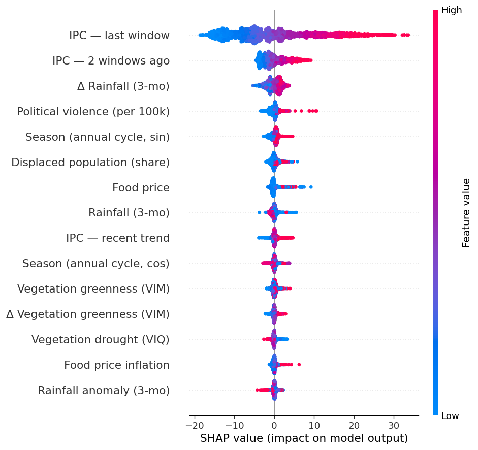
SHAP chart for the main nowcasting model.
Does it scale? Admin-2
Admin-1 areas are provinces. Admin-2 areas are the districts inside them, so this is a finer view. Running the same pipeline one level down is a good test, because this is the level where targeting and early-warning decisions are actually made.
The “why” model gets stronger. At the district level the drivers finally beat the country-average baseline, because a finer view reveals real differences inside each country for the drivers to explain.
| level | baseline R² | best driver model R² | drivers beat baseline? |
|---|---|---|---|
| admin-1 | 0.549 | 0.529 | no |
| admin-2 | 0.557 | 0.610 | yes |
The “now” model holds. Same improvement over carry-forward, same behaviour, and localisation still adds nothing.
| admin-1 | admin-2 | |
|---|---|---|
| main model R² | 0.749 | 0.698 |
| improvement over carry-forward | +17.8% | +18.5% |
| change-direction r | 0.54 | 0.55 |
| countries beating carry-forward | 17/21 | 22/25 |
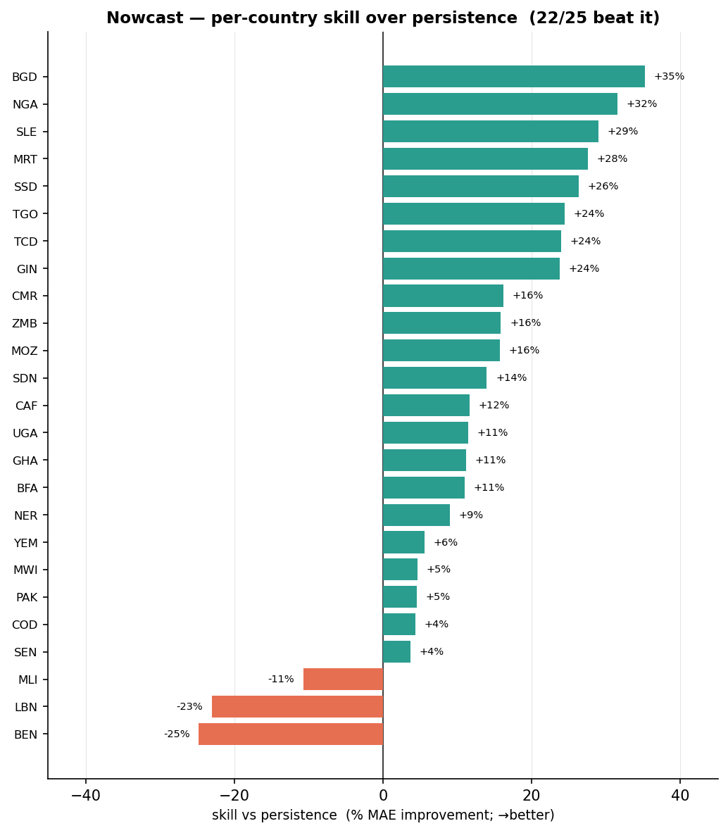
Admin-2 nowcast: per-country improvement over carry-forward. The result carries to the finer level.
The nowcast, live
Everything above is a summary of the backtest. The map below shows the model’s actual output. Each admin-1 area is coloured by its latest nowcast of the IPC Phase 3 or above share. Hover an area to see its trend, with the observed IPC assessments (solid) and the nowcast (line), and a dotted connector from the last real assessment to the latest nowcast. Click a province to zoom in. For Cameroon and DR Congo this drills into the admin-2 layer, the same model one level finer, at the resolution where decisions are actually made.
Latest nowcast of the IPC Phase 3 or above share (% of population). Admin-1 for all four countries. Click Cameroon or DR Congo provinces to drill into admin-2. Afghanistan and Somalia show admin-1 only, because their admin-2 boundaries do not line up with the assessment data.