1. Introduction
Anatomy of a Global Crisis
Zero Hunger by 2030: a promise still unfulfilled
In 2015, all United Nations Member States adopted the 2030 Agenda for Sustainable Development The 2030 Agenda is a universal call to action to end poverty, protect the planet, and improve the lives and prospects of everyone, everywhere. It encompasses 17 Sustainable Development Goals (SDGs) tackling global challenges., whose second goal, "Zero Hunger" (SDG 2), commits the international community to «end hunger, achieve food security and improved nutrition and promote sustainable agriculture». Over a decade later, that promise remains dramatically distant.
In 2024, approximately 673 million people were still undernourished, and in 2025, 266 million in 47 countries were facing acute food insecurity; in the same year, famine was confirmed in certain areas of the Gaza Strip and Sudan. Hunger, in short, remains a present-day emergency.
It is precisely to tackle this urgent challenge that the HERO project was born. HERO aims to leverage advanced data analysis and predictive modeling to infer the root causes of food crises before they escalate, providing actionable insights to help the global community stay on track toward achieving Zero Hunger.
Expert Insight: The View from the Field 
As part of the development of our project, we had the pleasure of interviewing Alice Giorgio, Data Scientist at the World Food Programme (WFP). With years of experience working as a Data Scientist and an academic background in Economics from Bocconi University, Alice also shares a strong educational connection with us, having enrolled in the Master's in Big data and artificial intelligence at the University of Pisa.
The main objective of our conversation was to gather feedback on our methodological approach. Discussing our framework with a domain expert provided us with valuable technical insights and a real-world perspective on how to refine our model for maximum reliability and impact.
Throughout the rest of this narrative, you will find snippets of her commentary interspersed alongside our findings. Her quotes provide a crucial bridge between our data-driven models and the operational realities of humanitarian action on the ground.
Measuring the Breaking Point
Before exploring the evolution of these crises, it is essential to understand how hunger is measured globally. The standard metric used by humanitarian organizations is the Integrated Food Security Phase Classification (IPC) The IPC is a standardized global scale that classifies acute food insecurity into five severity phases: 1 (Minimal), 2 (Stressed), 3 (Crisis), 4 (Emergency), and 5 (Catastrophe/Famine). Source: ipcinfo.org. Throughout our analysis, we specifically focus on the percentage of a country's population in IPC Phase 3 or higher (Phase 3+). This threshold represents the critical tipping point where populations face acute food insecurity or are forced to deplete essential livelihood assets just to survive, requiring urgent humanitarian intervention.
Trends of food insecurity
Not all food crises evolve in the same way. When we track the percentage of the population facing IPC Phase 3+ over time, distinct structural patterns emerge. Some nations, like South Sudan, endure a chronic crisis baseline punctuated by severe oscillations. Others, such as Haiti, suffer from a continuous deterioration, where food insecurity climbs steadily year after year without relief. Finally, there are countries like Sudan, which maintained relatively stable levels of hunger until a sudden, catastrophic shock, like the outbreak of a civil war, completely destabilized their entire food system.
As illustrated in the interactive chart above, Haiti's trajectory shows a devastating upward climb, rising from under 20% in late 2017 to over 50% by 2026. South Sudan, on the other hand, remains trapped in a volatile loop, repeatedly fluctuating between 35% and 65% as seasonal and localized shocks hit a deeply fragile baseline. Sudan tells perhaps the most dramatic story of the three: a relatively stable environment (remaining under 25%) that was violently shattered in early 2023. The onset of systemic conflict caused an immediate structural shock, resulting in a sudden escalation that peaked near 55% and destroyed the country's previous stability.
HERO: Hunger Early-warning & Risk Optimizer
Global food security is not threatened by a single factor, but by a complex, interconnected web of crises: armed conflict, extreme climate events, macroeconomic instability, and forced migration. To disentangle this complexity, we created HERO (Hunger Early-warning & Risk Optimizer), a Big Data architecture designed to analytically dissect and anticipate these humanitarian emergencies.
Rather than merely describing the current state of global hunger, HERO was built to look ahead. Our primary objective is to radically refine how food crises are forecasted. Instead of relying on a "one-size-fits-all" global model, HERO leverages a novel approach: predicting the level of food insecurity of a specific region by leveraging data from other countries that share the exact same "DNA" of crisis drivers. If we understand how a specific sequence of climate and economic shocks historically unfolded in one nation, we can use that pattern to issue early warnings for another country, structurally similar yet distinct, that is currently facing the same initial shocks.
To achieve this, HERO integrates massive global data streams, spanning from geopolitical instability to precipitation anomalies, and analyzes them at the sub-national level (Admin1). This geographic choice is strategic: it allows us to overcome the severe data scarcity found at the hyper-local level (Admin2), while still capturing critical regional nuances that get lost in broad national averages.
Alice Giorgio
Senior Data Analyst
WFP - VAM Unit
"Data in our field are often a mess. Handling missing data and finding the right geographical granularity is the most critical aspect to address if we want these models to be truly operational and reliable."
By clustering regions with affine drivers, HERO acts as a true early-warning system, enabling humanitarian organizations and policymakers to plan timely, data-driven interventions before an emergency turns into a catastrophe.
Curious about the outcome? Click for a spoiler of the results!
Key Findings Anticipation
Our intuition proved correct: grouping regions by their dominant drivers (e.g., predicting a conflict-driven region by training the model only on other conflict-driven regions) outperformed standard global models. We discovered that food prices and conflict are the strongest structural drivers of hunger, while rainfall anomalies serve as the most critical, early-warning signal for changes in food insecurity. (We'll dive deeply into the predictive modeling at the end of this page).
2. Data: Exploration, Drivers, and the Missing Data Challenge
The Root Causes: Decoding the Drivers of Crisis
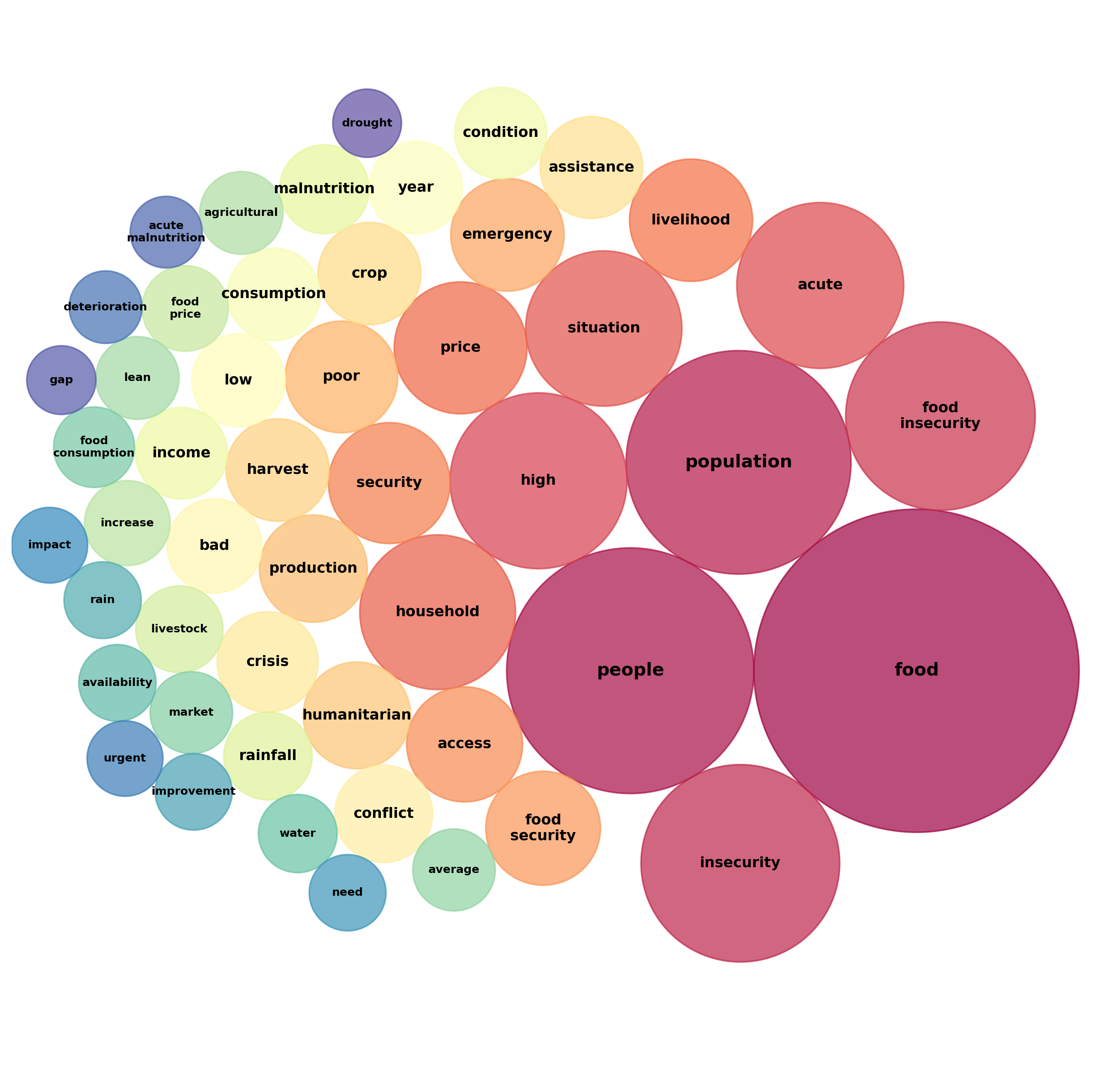
This map illustrates the most frequently occurring terms in official IPC crisis reports. The prominence of words like "price", "production", and "conflict" highlights the real-world drivers that shape food insecurity.
Discover the full Text Analysis here →
To anticipate a food crisis before it strikes, we must understand the underlying forces that trigger it. To build the HERO architecture, we integrated six multidimensional streams of global data spanning from 2017 to 2026, each representing a crucial piece of the humanitarian puzzle:
Conflicts (ACLED)
To gauge the direct threat to human life, we analyzed data on political violence, armed clashes, and attacks against civilians. By normalizing casualty data and event frequency per 100,000 inhabitants, we were able to accurately compare the true scale of violence across demographically dissimilar regions.
Precipitation (CHIRPS)
Using satellite-based estimates, we measured monthly rainfall and flagged critical anomalies against thirty-year historical averages. This allowed us to spot the early warning signs of devastating droughts or sudden floods long before harvests failed.
Vegetation Health (NDVI)
The NDVI index measures the density and vigor of agricultural crops. Analyzing this data let us quantify the stress of climate shocks on vegetation, catching agricultural decline before it translated into a food crisis.
Food Markets (WFP)
Relying on comprehensive data from the World Food Programme, we reconstructed the heart of local economies. By analyzing the cost of the basic food basket and local inflation, we captured sudden economic shocks that cut off food access for the most vulnerable.
Internally Displaced Persons (IDP)
When violence or climate disasters strike, people are forced to flee. By extracting internal migration flows as a percentage of the total population, we assessed the demographic pressure placed on host communities.
Sentiment and news (GDELT)
Leveraging the GDELT Project's global database, we integrated pre-calculated metrics on the tone and volume of news coverage. This allowed us to quantify the external perception of the crisis, mapping how international attention shifted as emergencies unfolded.
Curious about how we aggregated, cleaned, and handled these massive datasets? Dive into our full Data Collection methodology →
The Domino Effect: How Driver Anomalies Trigger Food Crises
Knowing the drivers is only half the battle; understanding how they interact and evolve over time is what makes early warning possible. Food crises are rarely the result of a single isolated event. Instead, they unfold as a cascade: a prolonged drought compromises vegetation, which in turn drives up local food prices, creating economic desperation that often sparks or exacerbates violent conflicts. By mapping the trajectories of these drivers alongside IPC severity, we can visualize this domino effect in action.
Political and Social Shocks: Play the Detective
When we examine the trajectories of political and social drivers against food insecurity, major geopolitical events leave an unmistakable signature on the data. Before reading our analysis of the next two countries, we challenge you to play the detective: explore the interactive charts, observe the anomaly spikes, and try to pinpoint the exact moment structural shocks occurred. (Hint: you can use the toggles in the charts to hide or reveal the key events!)
Case File #1: Afghanistan’s Tipping Point
Did you manage to crack the case?
If you toggled the key event marker, you noticed how everything changes abruptly in May 2021. The withdrawal of US troops didn't just cause political upheaval; it triggered an immediate surge in crisis levels, shattering the country's previous stability.
Dive Deeper: The US Withdrawal
The departure of international forces led to an immediate collapse of the Afghan economy. Overnight, international aid, which previously funded 75% of public spending, was frozen. This sparked hyperinflation, massive unemployment, and an unprecedented liquidity crisis that crippled food access across the entire nation.
Case File #2: Sudan’s Shattered Stability
Let's test your investigative skills again, this time looking at Sudan. Historically, Sudan presented a very different baseline compared to Afghanistan, maintaining relatively stable food insecurity levels. But stability can be deceiving. Explore the dashboard below and try to identify the exact moment the trend line violently breaks. (Hint: toggle the key event marker in the legend when you think you've found it!)
Did you spot the rupture?
The data unmistakably shatters on April 15, 2023. This marks the outbreak of the devastating civil war. Unlike a slow-moving climatic drought, this sudden, explosive political conflict caused an immediate and massive structural shock, destroying the country's prior stability and causing hunger levels to soar.
Dive Deeper: The Sudanese Civil War
The conflict erupted violently between the Sudanese Armed Forces (SAF) and the Rapid Support Forces (RSF), turning the capital, Khartoum, and surrounding regions into active war zones. The fighting immediately severed major supply chains, triggered mass displacement, and destroyed critical infrastructure, effectively weaponizing starvation and sparking one of the fastest-growing humanitarian disasters in modern history.
The Rhythm of the Rains: Profiling Climatic Diversity
Unlike political shocks, which are sudden and structural, climatic drivers like rainfall are inherently cyclical. However, this rhythm is completely dictated by geography. In the dashboard below, we compare the rainfall profiles of Madagascar, Mozambique, Senegal, and Ethiopia. Explore the time series and the radar plot (which visualizes seasonality across the months of the year) to discover how drastically rainfall intensity and timing differ across the continent.
Chart Note: The vertical axis in the time-series plot (as well as the radial axis in the seasonality radar plot) expresses monthly precipitation depth in millimeters (mm).
Mozambique & Madagascar
These two nations share very similar profiles, experiencing massive, high-intensity rainfall peaks between January and March.
Ethiopia
Ethiopia sees its primary rainfall peaks later in the year, particularly in July and August, but with much lower overall intensity compared to the torrential rains of Mozambique.
Senegal
Senegal operates on a strict, concentrated cycle. It matches Ethiopia's intensity but is highly localized: heavy peaks hit in August and September, while the rest of the year is almost entirely dry.
Take Control of the Data
Want to explore these trends yourself? We've built a dedicated Interactive User Interface where you can freely navigate, filter, and dive deep into the statistics and distributions of all the humanitarian drivers we've collected.
Launch the User InterfaceZooming In: Why National Averages Aren’t Enough
As we highlighted when introducing the HERO architecture, our models operate mostly at the admin-1 (regional/provincial) level. Why is this geographical granularity so crucial? Because food crises rarely strike a country uniformly, and relying solely on broad national aggregates often masks devastating localized shocks.
To illustrate this, the interactive heatmap below visualizes temporal anomalies (isolated via residual analysis) in the IPC Phase 3+ time series across the different micro-regions of Afghanistan. While a national average might simply show a general upward trend, this regional breakdown reveals the true anatomy of a crisis. Notice how, immediately following the May 2021 shock, intense anomaly clusters flare up across multiple specific provinces. This proves that to accurately anticipate a crisis, we must look beyond the national surface and monitor the local realities.
The Invisible Enemy: Tackling Missing Data
Alice Giorgio
Senior Data Analyst
WFP - VAM Unit
"Missing data remains one of the most critical pain points in this field. You simply cannot accurately predict what you cannot see."
Our shift to admin-1 level analysis was a strategic move to preserve data integrity, but it didn't eliminate the issue completely. As the interactive heatmap below reveals, the distribution of missing data is highly uneven across both space and time. Notice how the significant gaps impact large parts of the African continent and the Middle East, particularly prior to 2021.
As you can see in the matrix above, the prevalence of these missing values forms the primary obstacle in our analysis. This "pain point" threatens to degrade the performance and reliability of our predictive models. Furthermore, as we attempt to drill down into more granular data, sparsity increases exponentially. At the admin-2 (district) level, datasets like ACLED (conflict tracking) become particularly compromised.
Mapping the Void: Structural Missingness
But these data gaps aren't just random noise, they have a distinct, structural pattern. When we mapped the correlation of missingness across our different drivers, we uncovered that data outages occur in distinct, interconnected blocks.
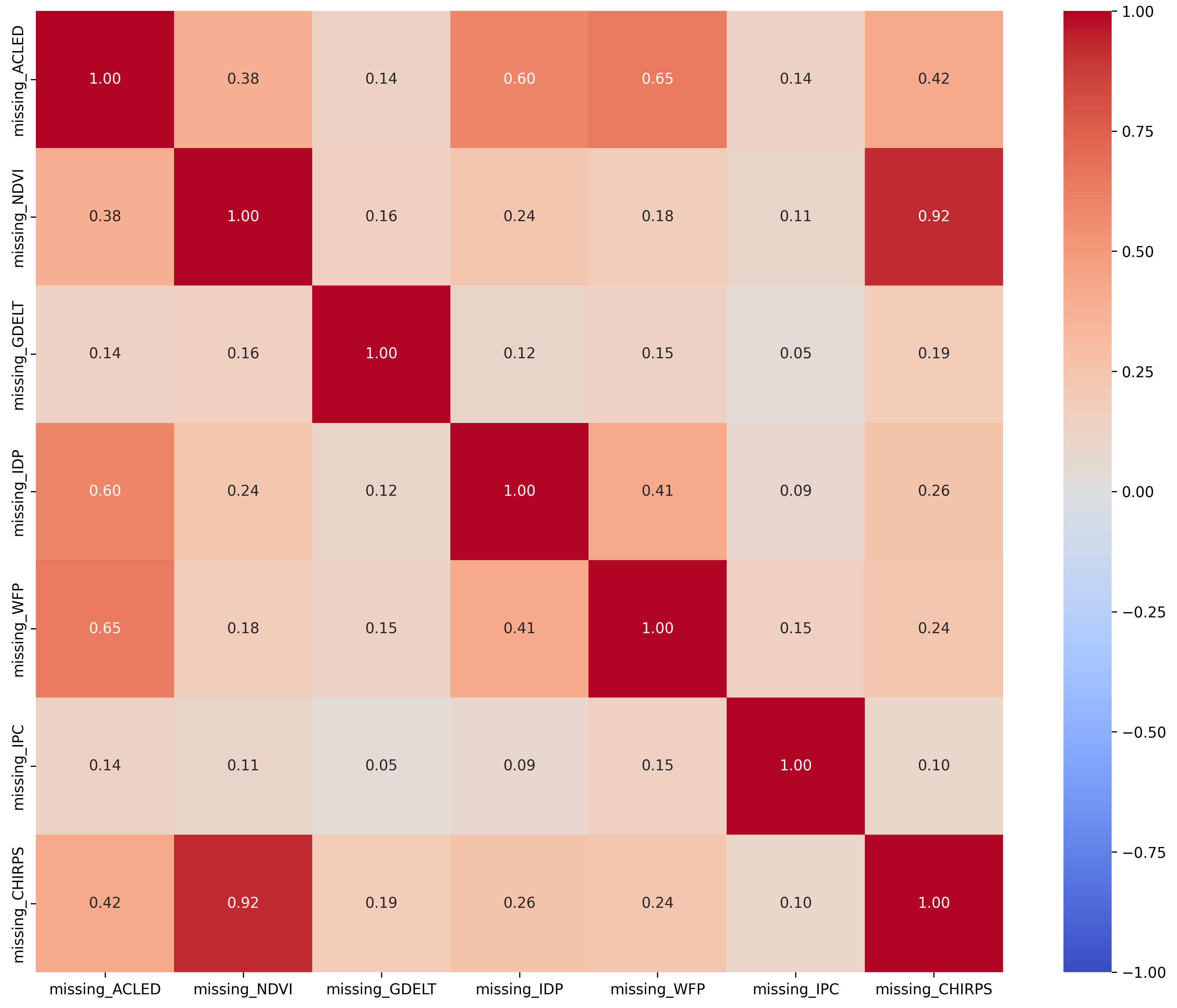
As illustrated in the correlation matrix, environmental sensor blackouts exhibit severe collinearity. There is a 0.92 correlation between NDVI and CHIRPS, meaning that when one satellite metric fails, the other is almost guaranteed to be offline. Even more tellingly, the loss of conflict tracking data (ACLED) is critically linked to logistical blindness on the field. It correlates strongly with missing market vulnerability data (WFP, 0.65) and displacement metrics (IDP, 0.60). This reveals a profound truth about data collection: violent events directly disrupt on-the-ground humanitarian reporting pipelines, resulting in compounded analytical blind spots exactly when crises are most acute.
Alice Giorgio
Senior Data Analyst
WFP - VAM Unit
"Understanding the precise origin of missing values is critical before applying statistical interventions. Implementing 'blind imputation' without knowing the underlying causes actively harms the explainability of the models. We often cannot know the true cause: is an ACLED blackout signifying a genuine absence of conflict, or conversely, a situation so violently unstable that on-the-ground reporting has completely collapsed? Similarly, missing WFP data often means environments are simply too dangerous for humanitarian surveyors to operate in. To mitigate these structural blind spots, analytical strategies must cross-reference external data sources."
Despite these immense challenges and the inherent risks highlighted by experts, an early warning system cannot function on empty spaces. This is where clustering came into play.
“Augmenting” Reality: The Clustering Approach
If we can't always collect the data in the field, we must strategically "augment" the data we do have. To find the most reliable imputation method, we evaluated how geographic proximity and statistical profiles influence the data structure, testing everything from Hierarchical models to K-Means.
We eventually deployed a K-Nearest Neighbors (KNN) algorithm. It proved to be the most effective at identifying coherent, well-separated neighbors across different regions. This ensures that when we fill a missing data point, we are using the profile of a truly similar, statistically verified neighbor, maintaining data integrity and minimizing the uncertainty inherent in any imputation. We will utilize these clustering results to refine our predictive models in the next phases.
Love the technical math behind silhouette scores and spatial clustering? Explore the full methodology in our Data Augmentation section →
3. From Words to Data: Decoding the Narrative
But numbers, no matter how rigorously clustered or augmented, only tell half the story. Behind every statistical peak or missing data point lies a complex human reality, vividly captured in the qualitative text of the IPC reports. To move beyond simple word counts and uncover the hidden semantic structures of food crises, we deployed an advanced Natural Language Processing (NLP) pipeline. We leveraged powerful pretrained models to "read" these reports and let the raw text organize itself into coherent, thematic clusters.
1. Anonymization: Hiding the Map
Before our algorithm could analyze the vocabulary, we had to strip away its biases. If we fed the raw reports to the model, it would naturally group texts simply because they mentioned the same country or year, missing the deeper semantic connections. Using an advanced entity recognition model, we systematically masked all dates and geopolitical names, effectively "hiding the map." By blinding the algorithm to where and when a crisis occurred, we forced it to focus entirely on why it occurred, uncovering the true, underlying drivers of food insecurity regardless of borders.
Original Text
"The 8th analysis cycle on the Integrated Food Security Classification Framework (IPC) of DRC held in December 2012 identified 6.4 million people affected by a situation of food and livelihood crises, 77 regions have been classified in phase 3 and 8 regions in Phase 4 throughout DRC."
Anonymized Text
"The 8th analysis cycle on the Integrated Food Security Classification Framework (IPC) of [AFFECTED_AREA] held in [DATE] identified 6.4 million people affected by a situation of food and livelihood crises, [AFFECTED_AREA] have been classified in phase 3 and [AFFECTED_AREA] in Phase 4 throughout [AFFECTED_AREA]."
2. The Power and Limits of Keywords (TF-IDF)
Our first instinct was to use TF-IDF (Term Frequency-Inverse Document Frequency), a classic statistical method that groups reports based on the frequency of identical words. Below, you can see two reports that the algorithm grouped together simply because they share the exact same vocabulary (highlighted in yellow) to describe a complex agricultural and economic shock. In cases like this, TF-IDF works perfectly.
Zimbabwe (Apr 2013 - Apr 2014) - Agro-Economic Shock
"Agriculture is a key livelihoods activity for the majority of Zimbabwe's rural population. Mainly because of the poor rainfall season quality, production of major crops in 2012/13 fell compared to last season's harvest. Livestock were in a fair to good condition in April 2013. Grazing and water for livestock were generally adequate in most parts of the country save for the communal areas... Currently, staple cereals are generally available throughout the country from both own production and the market, but low incomes and higher than normal prices of staple cereals are limiting household access. There is continued limited diversity of food consumed by rural households..."
Uganda (Jan 2017 - Feb 2018) - Agro-Economic Shock
"Food in markets is easily accessed and affordable because prices have declined and the households have adequate purchasing power. They have good nutrition levels because they are able to eat two or more time a day with a good dietary diversity. Currently access to livestock products is good because of the available pasture and water... The households in these regions all suffered the effects of prolonged dry spells that stressed most of the crops and reduced yields... However, as the production in the second season is anticipated to be normal and above normal for some areas... They have poor purchasing power as their incomes are low..."
While TF-IDF is highly effective when reports use the exact same terminology, it has a fatal flaw: it relies entirely on exact keyword matches. This makes it incredibly vulnerable to False Positives. Because many IPC reports use the same standard humanitarian boilerplate language, TF-IDF will often cluster them together, completely ignoring the true underlying cause of the crisis.
Take a look at the two reports below. TF-IDF confidently clustered them together because they both heavily use generic words like "malnutrition", "child", "production", and "season" (highlighted in yellow). However, look at the actual climatic shock that triggered the crisis: Angola is suffering from the worst drought in 40 years (highlighted in red), while Bangladesh is submerged by severe river flooding (highlighted in blue). TF-IDF grouped a crisis of "no water" with a crisis of "too much water" just because the humanitarian jargon matched!
Angola (Apr 2021 - Mar 2022) - Drought Shock
"The worst drought in the last 40 years and rising food prices have resulted in high acute food insecurity... The high acute food insecurity in this region can mainly be attributed to the recurrent effects of drought which has reduced both agricultural and livestock production... An IPC Acute Malnutrition analysis of 10 municipalities in Southern Angola has revealed that around 114,000 children under the age of five are suffering or are likely to suffer from acute malnutrition... For the period of October 2021 to February 2022, a projection analysis of the situation suggests that the rainy season, characterized by food shortages and high incidence of acute malnutrition, may lead to a deterioration..."
Bangladesh (Sep 2014 - Dec 2014) - Flooding Shock
"During the flooding, crop land and homesteads deluged with water and cause severe damage to standing crops... Flood water brings huge silt and sands and cultivable lands lose its productivity... Analysis revealed that income opportunities may be greatly hampered due to the 2014 flooding and consequent river erosion. Fish production is also negatively affected... Child Malnutrition: The districts and upazilas analyzed structurally suffer from the alarming level of acute malnutrition... shocks due to flooding and consequent river erosion... alarming level of acute child malnutrition."
3. Dense Embeddings: Finding the Meaning
To break free from the keyword trap, we needed a model that could read between the lines. We advanced to Dense Semantic Embeddings using the pretrained BGE-M3 model. Instead of blindly counting words, this architecture maps entire paragraphs into a high-dimensional mathematical space, grouping texts purely by their underlying meaning. This breakthrough allowed us to uncover previously invisible connections, successfully linking reports that described the exact same structural crisis, even when they used different vocabularies.
Discovery: Connecting Different Words to the Same Crisis
To demonstrate what we gained by moving to dense embeddings, look at how the model connected a report from El Salvador with one from Zambia.
Because they use completely different phrasing ("mobility restrictions" versus "reduced livelihood opportunities"), TF-IDF would struggle to link them. But the dense embedding model recognized they were describing the exact same underlying tragedy: families plunged into food insecurity by the economic paralysis of the COVID-19 lockdown.
El Salvador (October 2020 - February 2021)
"These groups have experienced income losses due to mobility and transportation restrictions due to the COVID-19 pandemic... This reduction of income limits affected households' access to basic services and food."
Zambia (July - September 2022)
"The current vulnerability in Zambia has been driven by a high incidence of poverty, the impact of the COVID-19 pandemic, macroeconomic instability... primarily driven by shocks such as prolonged dry spells, flooding, reduced livelihood opportunities due to restrictions linked to COVID-19."
Fascinated by advanced NLP and semantic pipelines? Explore the full methodology in our Technical Text Analysis section →
The Interactive Timeline: A History of Crisis
With the reports finally grouped by their true underlying causes (our semantic clusters), we could start tracking them over time. Food insecurity is rarely a static condition; it evolves. By mapping out the dominant crisis type for each country year by year, we built the interactive timeline below. You can explore how nations shift from agricultural shocks to economic inflation, or how conflict suddenly hijacks a country's entire food system.
Select a country from the sidebar to isolate its unique journey through the crisis landscape.
Crisis Profiles: Shared Destinies
Alice Giorgio
Senior Data Analyst
WFP - VAM Unit
"The most important thing in this field is to identify the crisis profile in order to understand how a crisis will evolve in a certain country, and adapt our decision-making accordingly."
The most startling revelation from the dense clustering was the discovery of Crisis Profiles, representing nations that share identical evolutionary paths in their food insecurity crisis. By removing borders, the data showed us that risk follows specific, recurring patterns. Below, we present one striking example of these profiles. (Hover over the highlighted text to reveal the historical context).
The Agro-Pastoral Climate Trap (Kenya & Uganda)
Kenya and Uganda are bound by a shared geographical vulnerability. We see both nations plunge into Agro-pastoral Water Vulnerability due to prolonged droughts (2013-2017), which devastated both agriculture and pastoralism, culminating in 2017 when the Kenyan government declared the drought a national disaster In early 2017, Kenya officially declared a national disaster, appealing for international food aid as millions faced starvation due to widespread crop failure and livestock deaths.. Between 2020 and 2023, the Horn of Africa experienced an unprecedented five consecutive failed rainy seasons, pushing millions into high levels of food insecurity. This is a classic climate-driven trap, where communities have no time to recover before the next environmental shock hits.
Looking Ahead: Clustering by Trajectory
The discovery of these synchronized crisis profiles opens a door for future research. Instead of classifying regions merely by their current dominant topic, what if we clustered them by their entire crisis sequence? By grouping nations that share the same "DNA" of crisis evolution (e.g., the Climate-to-Economic-Collapse pattern vs. the Chronic-Conflict-Trap), predictive models could anticipate the next phase of a food crisis simply by recognizing the historical precedent set by another country in the same trajectory group.
4. Predicting Food Insecurity: From Insight to Foresight
We've seen how tracking the semantic "DNA" of a crisis reveals its underlying path. But understanding the past and present is only half the battle. The ultimate goal of our investigation is foresight. If we know the core drivers, such as climate shocks, economic volatility, and hidden conflicts, can we actually predict where hunger will strike next?
To answer this, we built two distinct models to tackle two critical questions:
Question 1 · Static inference: What explains where hunger is?
- Hunger is context-dependent: The same drop in rainfall or the same level of conflict means different things in the Sahel, the Horn of Africa, or Central America. A single global rule fails to capture these nuances, often performing worse than a simple baseline like the country's historical average.
- Localizing fixes this: We train separate models for smaller groups of similar areas. The grouping that works best is determined by what an area's IPC reports actually discuss—such as conflict and refugees, farming and water, or prices and inflation.
- Key Drivers: Across most contexts, food prices and conflict consistently emerge as the strongest predictors.
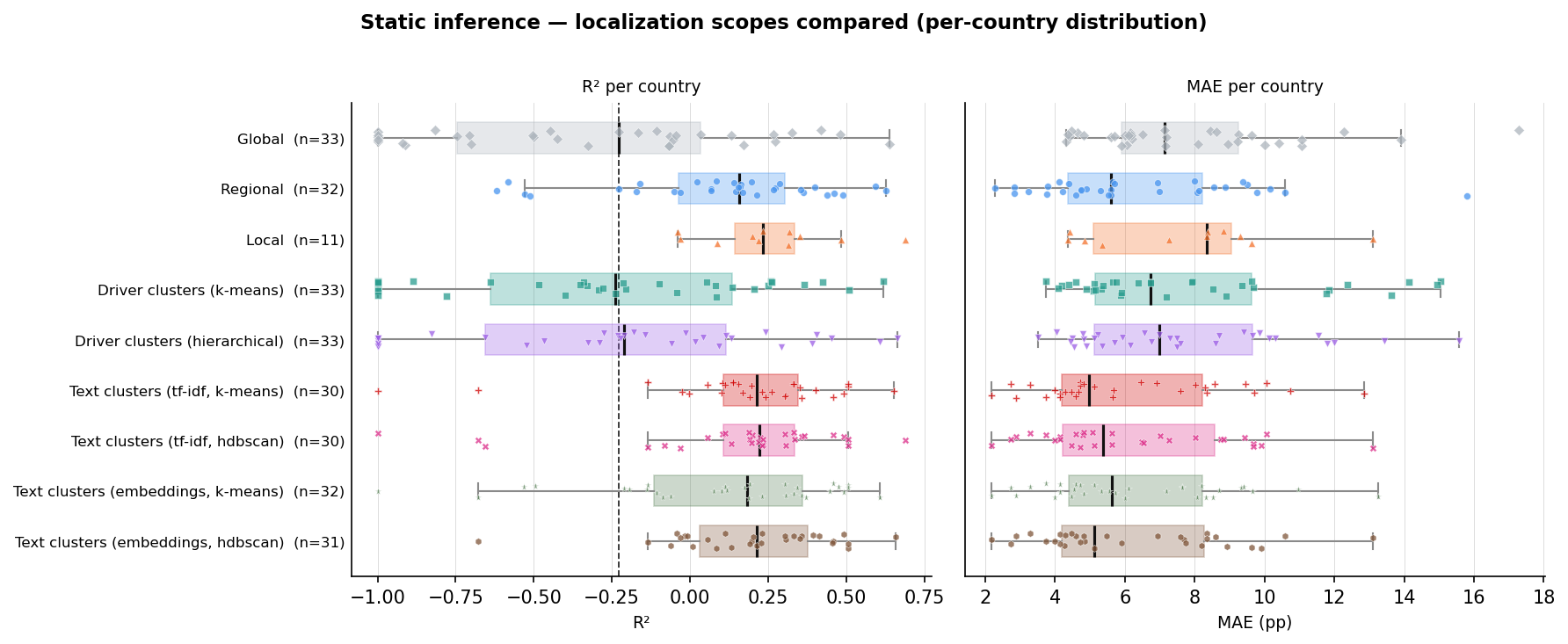
Accuracy by grouping method, scored per country. Boxes to the right of the dashed global line do better. Grouping by report text wins.
Alice Giorgio
Data Scientist
WFP
"Predictive models in this domain will inherently be imperfect. Because of this, uncovering the underlying correlations and causal drivers is often far more valuable than the raw predicted values themselves. Ultimately, explainability is even more important than performance."
In humanitarian work, decisions affect lives. An algorithm's output cannot be a black box; results must be explainable before anyone acts on them.
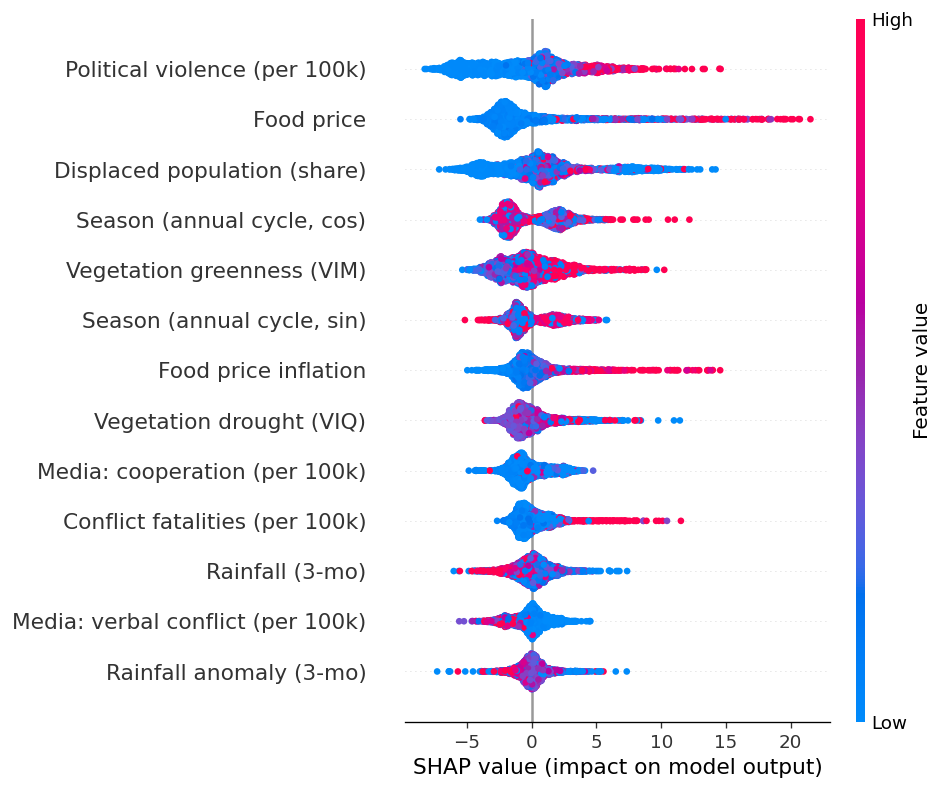
Higher food prices and more conflict push the predicted level of hunger up.
Question 2 · Nowcasting: What are hunger levels right now?
IPC assessments are slow, meaning a sudden shock can go completely unseen for months. To solve this, we developed a nowcasting model designed to accurately estimate current hunger levels by combining the most recent assessment with real-time driver data.
- Significant Accuracy Gains: The model achieves about an 18% lower error rate compared to simply carrying the last value forward, and crucially, it successfully tracks the direction of change.
- A Global Approach Works: In stark contrast to the static model, one global model is sufficient here. Once the algorithm factors in an area's historical baseline, hyper-localizing adds little predictive power.
- The Early Warning Signal: Among all the real-time drivers, rainfall anomalies act as the strongest early indicator of changes in levels of food insecurity.
Latest nowcast of the share of people in IPC Phase 3 or above. Hover for the trend, click to zoom.
Bonus Question · Forecasting: What will hunger look like months from now?
We also built a forecasting model that reads each region's history as a time series and projects it forward. Being honest, this is where we struggled most. Forecasting food insecurity months into the future proved much harder than explaining the present or nowcasting it, and the results came with noticeably lower performance.
"It's difficult to make predictions, especially about the future."
Yogi Berra / Niels Bohr
This question is still open. If you want to help us crack it, the dedicated section walks through the full time-series pipeline, the models we tried, and exactly where they fall short.
5. Conclusion
Zero Hunger by 2030 remains an unfulfilled promise. It is a genuinely hard problem: food crises emerge from many interacting drivers at once, and no single cause explains them all. The good news is that we are not short on data. The difficulty lies in making sense of it, especially since the assessments that matter most are often incomplete or out of date by the time they reach us.
HERO is our attempt to bring order to that complexity. It provides an architecture to study food crises more systematically through the lens of the drivers that shape them.
A central part of this was profiling crises and how they evolve. By reading IPC reports for their meaning rather than their vocabulary, we grouped crises by their true causes and tracked how these profiles shift over time.
On this foundation, we built two models to answer two different questions:
- Understanding hunger through its drivers. The key insight was localization: a good model has to account for the specific context of each country, because the same shock means different things in different places. This localization can be done effectively by grouping regions according to what their IPC reports, written by domain experts on the ground, actually describe. And because the model points to which drivers matter, its outputs stay explainable, which is essential when decisions affect lives.
- Keeping up with crises as they unfold. Because official assessments are slow, our nowcasting model continuously updates the estimated level of food insecurity as new shocks hit, so a sudden deterioration doesn't stay invisible for months.
Taken together, these pieces move HERO from describing hunger toward anticipating it. The work is far from finished, but it points to a practical path: combining the expertise already captured in humanitarian reporting with models fast enough to keep pace with the crises they aim to prevent, and transparent enough to act on.